
Print.
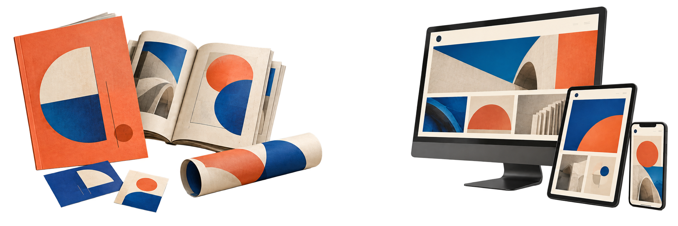
- Banners
- Catalogues
- Corporate materials
- Event stands
- Flyers
- Newspapers
- Posters
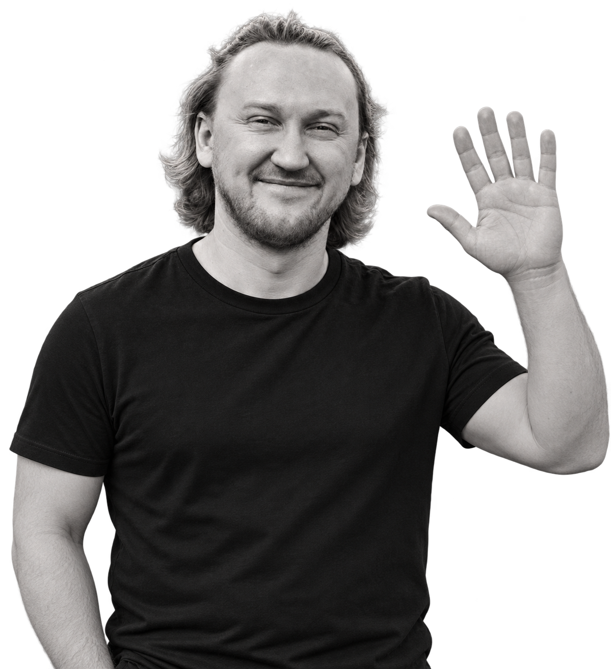
Hi! I’m Karol.
At your service.
 Scroll down
I earned a Master of Arts specialising in 3D graphics at the Technical Academy in Katowice, Poland.
My experience spans both in-house teams and agencies. I love refreshing existing designs and creating something new, with or without a brief.
I love connecting ideas from psychology, marketing and communication to create design that looks good, speaks clearly and makes sense for the people it reaches.
Craft comes first. I work with traditional design tools or AI, choosing the right approach for your preferences and your project’s needs.






projects
companies
years of experience
countries
Graphic design was my starting point. I expanded into copywriting and marketing to support my clients more fully.

CEO · Cofame
“I met Karol online in the design competition for my all-new AI chatbot, and I "successfully" picked up his design as the winner of the competition. Since then, I worked with for website pitch deck, and even another iPhone App.”

Creative Director · Success Story Dynamics
“Karol’s design pitch for our SuccessStory.com.au website was eye-catching and unique; we loved it and found Karol very enthusiastic and easy to work with when we needed changes and additions. He has always gone above and beyond for us, and I always look forward to seeing his new ideas and work.”

Production Development and Business Services Manager · Wedel
“Karol is in my opinion creative talent you are looking for originality, passion, and outstanding visuals. I highly recommend Him for any design project!”

Head of Marketing Communications · Tar Heel Capital Pathfinder

“Karol is a truly talented, creative, and professional Art Director. He brought his own ideas to the table and with the way he worked made the project process very efficient and ensured that I got what I needed. I definitely recommend him.”
Identities, campaigns and editorial design. Different formats, the same attention to detail.
For Sephora, I designed the Beauty Monday logo and promotional poster for makeup and skincare consultations in stores in Silesia. A playful world of oversized cosmetics and miniature beauty experts brings the event to life.
The custom lettering anchors the composition, while vivid pink and unexpected changes in scale make the event hard to miss.
As Deputy Art Director working with WRC rally magazine in 2016, I created advertising and editorial layouts for automotive brands including Audi, Porsche, Škoda and Volkswagen.
This pairing brings together an Audi TT Cup advertisement and an editorial page celebrating Gosia Rdest’s first podium. Strong hierarchy, racing photography and a disciplined grid keep the pace on the page.
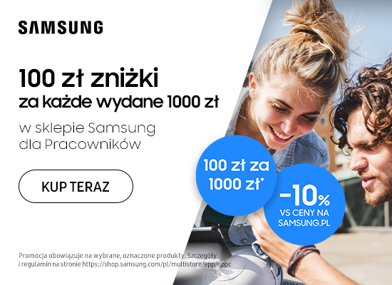
Between 2023 and 2026, I oversaw more than a dozen Samsung Poland campaigns within the Employee Purchase Programme, spanning email campaigns, banners, popups and supporting graphics.
This Galaxy S24 Ultra email combines a product-led opening with clear benefit sections and prominent calls to action, carrying a consistent visual story from the first screen to the final offer.
A theatrical poster for the sixth edition of the La Roche-sur-Yon International Film Festival, held in France on 12–18 October 2015.
Napoleon and his horse break out of a gilded frame, turning a familiar historical image into a larger-than-life cinematic scene. Deep burgundy, warm gold and bold typography give the composition the drama of a film poster.
About the 2015 festival ↗Between 2024 and 2026, I delivered six Douglas campaigns on employee benefits platforms, adapting each event-led concept to the brand’s visual identity.
This selected example celebrates International Women’s Day. Expressive lipstick strokes frame three portraits, bringing the message of individuality to life against a fresh mint background.
In 2025, I delivered four Arval campaigns on employee benefits platforms, developing event-led visuals tailored to the brand and the campaign message.
This selected holiday-themed artwork connects a new car with the promise of family adventures. A sweeping mountain landscape, warm light and bold typography turn the offer into a story about the journeys ahead.
Between 2019 and 2026, I created themed graphics for 21 Zalando campaigns on employee benefits platforms, adapting each occasion-specific concept to the brand’s identity.
This selected Halloween example gives fashion a playful supernatural twist. A floating outfit, orange accessories and dramatic lighting bring the seasonal theme into Zalando’s visual world.
In 2024, I delivered two IKEA campaigns on employee benefits platforms, creating occasion-specific graphics aligned with the brand’s visual language.
This selected back-to-school example turns an open notebook into a miniature study space. Familiar blue and yellow accents connect the imaginative setting with IKEA and the practical task of preparing for a new school year.
Between 2023 and 2026, I delivered around 20 informational and promotional Allegro campaigns on employee benefits platforms. Each visual was tailored to the event or communication need while staying aligned with the brand.
This selected banner explains changes to Allegro voucher rules. A large directional arrow, an unmistakable headline and vivid orange accents guide attention from the people to the message and call to action.
At Mera Systemy, I used technical drawings to develop the visual direction for new devices: material and finish choices, exterior graphics and the on-screen interface. The aim was to bring the physical product and its digital experience together.
I also created 2D and 3D visualisations to help Mera Systemy present proposed devices to its clients. This example shows a ticket machine with FlixBus branding, presented in a station setting.
Illustrative reconstruction with approximate dimensions.
I refreshed the Mera Systemy logo with a lighter, more contemporary identity that keeps its recognisable symbol. The redesign replaces the heavy boxed composition with an open wordmark, finer typography and a brighter blue accent.
Moving the symbol beside the name gives the identity more breathing room, while the wider spacing of “Systemy” creates a clear, balanced hierarchy.

Drag left or right to compare. You can also use the arrow keys.
I created an informational and marketing campaign for Coca-Cola HBC Poland to support the launch of an employee benefits platform. The materials introduced the offer, built anticipation and guided employees towards the platform.
A consistent red-and-white visual language connects the campaign across formats. The selected pieces show the range of benefits, from culture and sport to shopping, health and travel, through a teaser, a launch announcement and a vertical campaign visual.
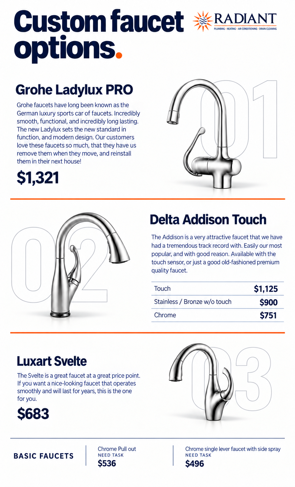
A leaflet refresh for Radiant, with a brief to retain the original product information and prices while making the offer easier to navigate.
I reworked the hierarchy, typography and spacing, organised the product options into clearer sections and brought the design closer to Radiant’s navy-and-orange identity. Compare the original leaflet with my redesign using the slider.
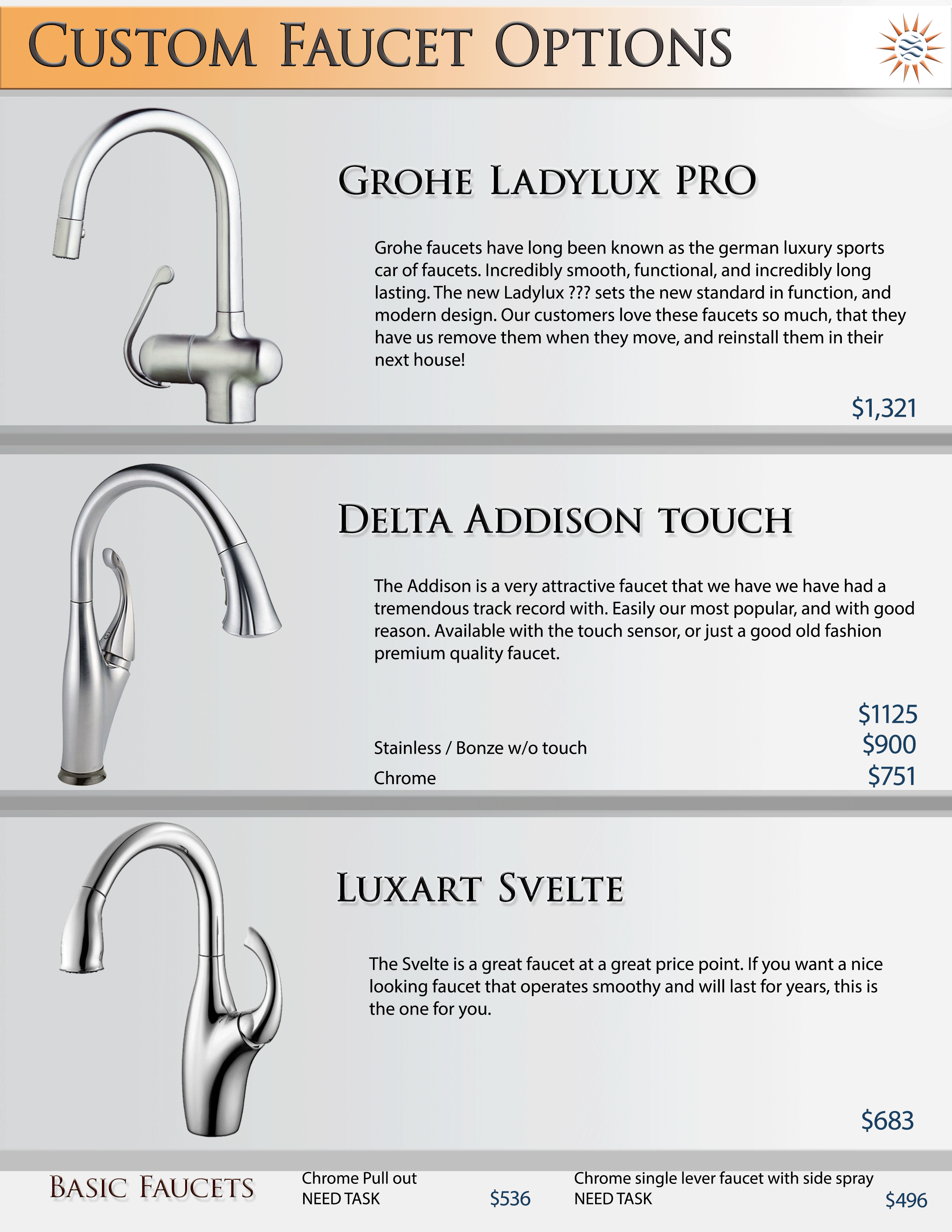
Drag left or right to compare. You can also use the arrow keys.
I redesigned the UI and UX of the Motivizer benefits platform to make browsing and purchasing simpler, clearer and more modern.
A streamlined interface, clearer navigation and a more direct purchase journey reduced the time users needed to complete a purchase by 35% and helped increase sales on the platform.
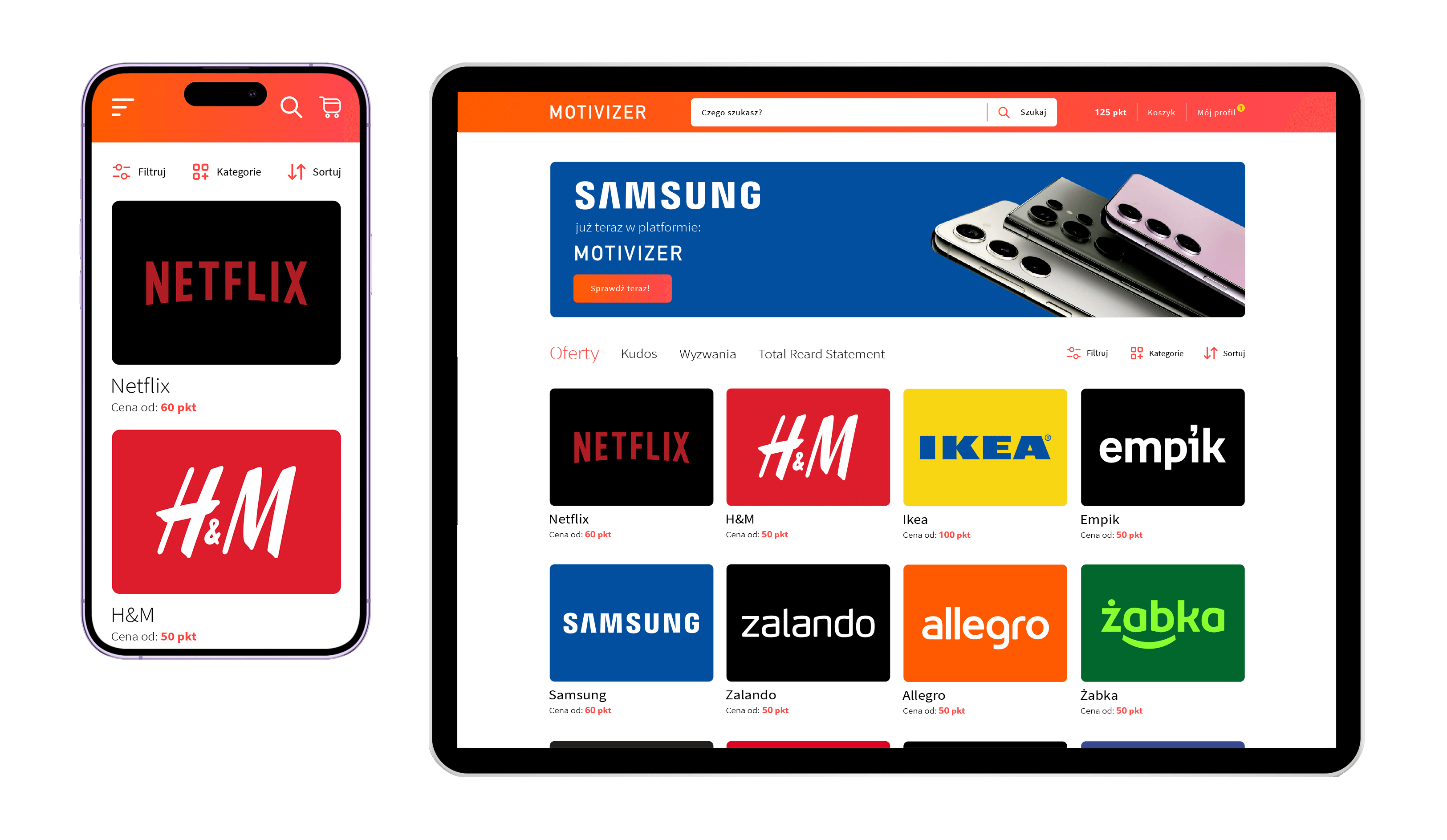
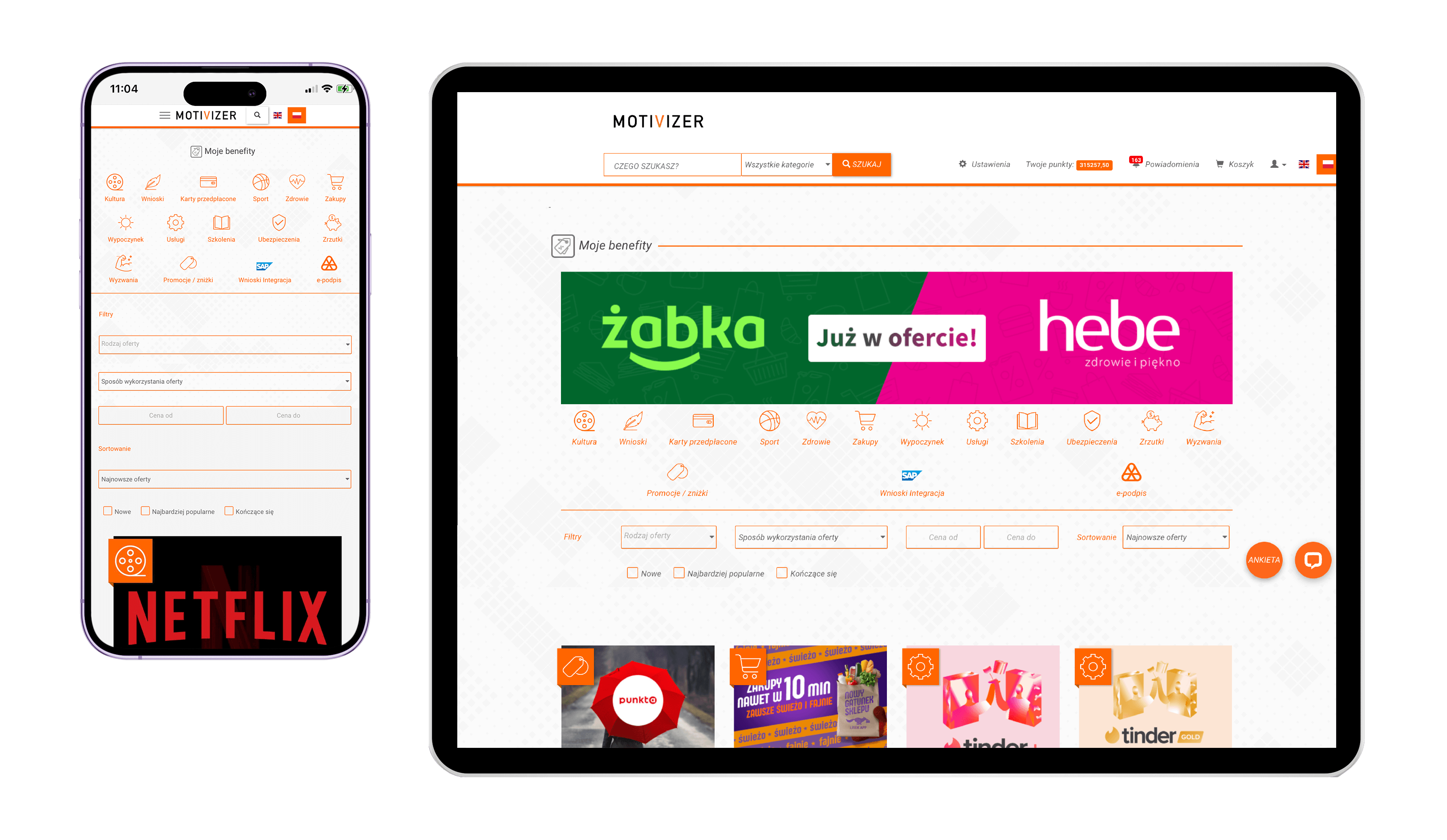
Drag left or right to compare. You can also use the arrow keys.
I refreshed the login screen for T-Mobile Poland’s internal platform, replacing a generic sign-in page with a clearer, more welcoming experience aligned with the brand.
The new layout brings the login, language selection and account activation into one organised panel. T-Mobile’s magenta and a contrasting visual give the page a stronger identity while keeping the form easy to find.
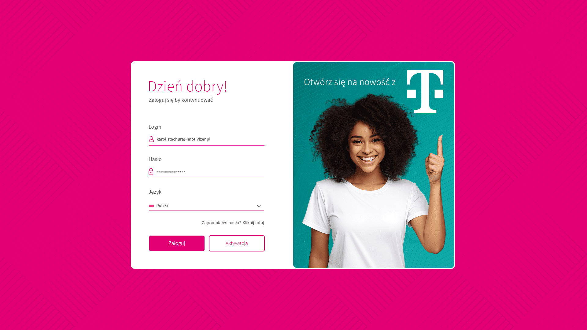
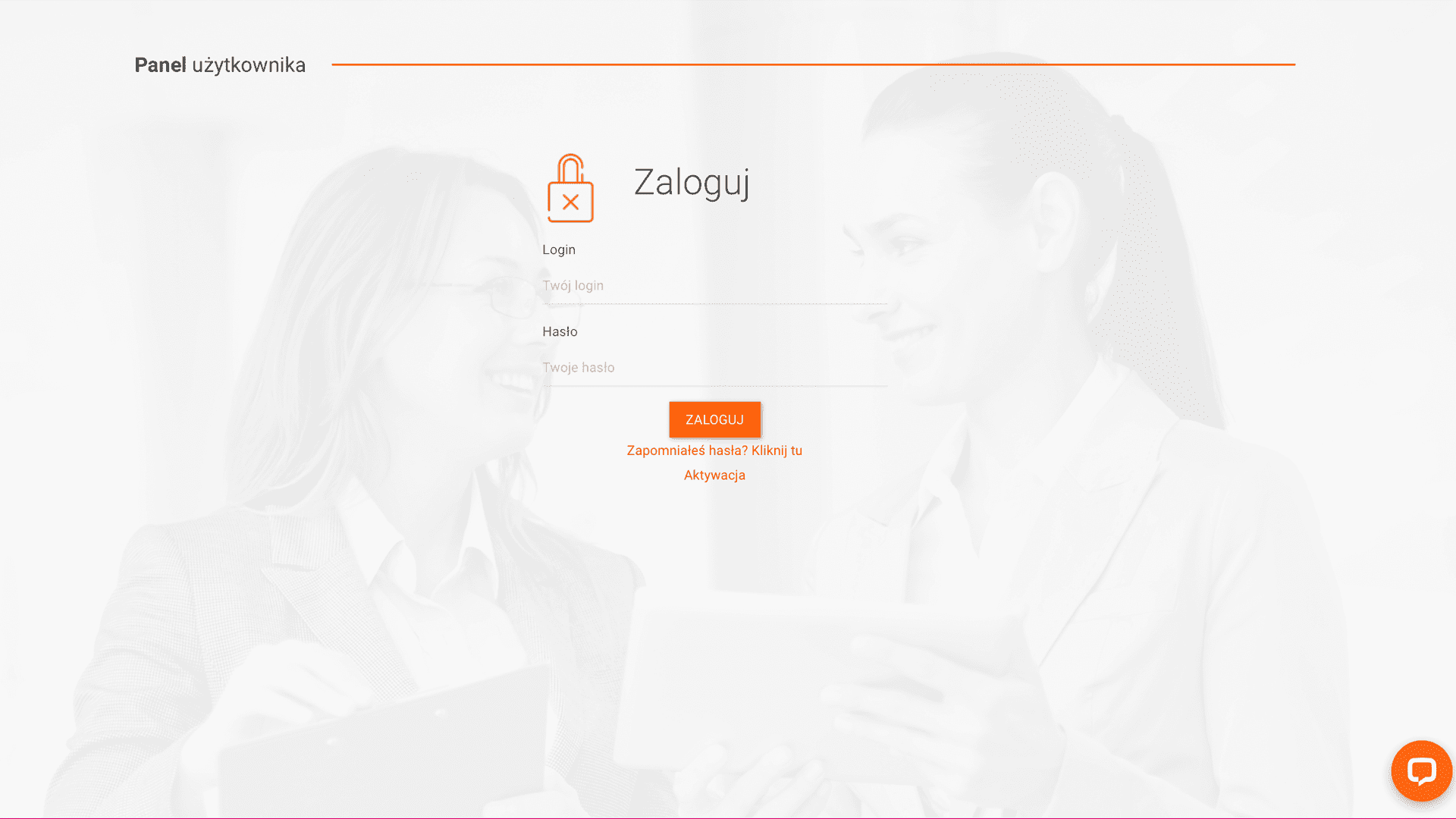
Drag left or right to compare. You can also use the arrow keys.
I redesigned Motivizer’s presentation slides to give its HR services a more distinctive visual voice. The selected slides cover onboarding, the company introduction, eCoaching, remote work and data privacy.
Stronger typography, vivid colour and conceptual collages replace the restrained photo-and-bullet layouts. Each slide has its own visual idea, while consistent hierarchy and orange accents connect the presentation into one coherent story.
Drag left or right to compare. You can also use the arrow keys.
A redesign of a TXM Christmas sales leaflet, bringing a stronger seasonal atmosphere to a busy retail offer.
I refreshed the composition, typography and price labels, using richer greens, red ribbons and a clearer product strip to organise the page. The new layout gives the headline and offers more visual impact while keeping the family scene at the centre of the story.
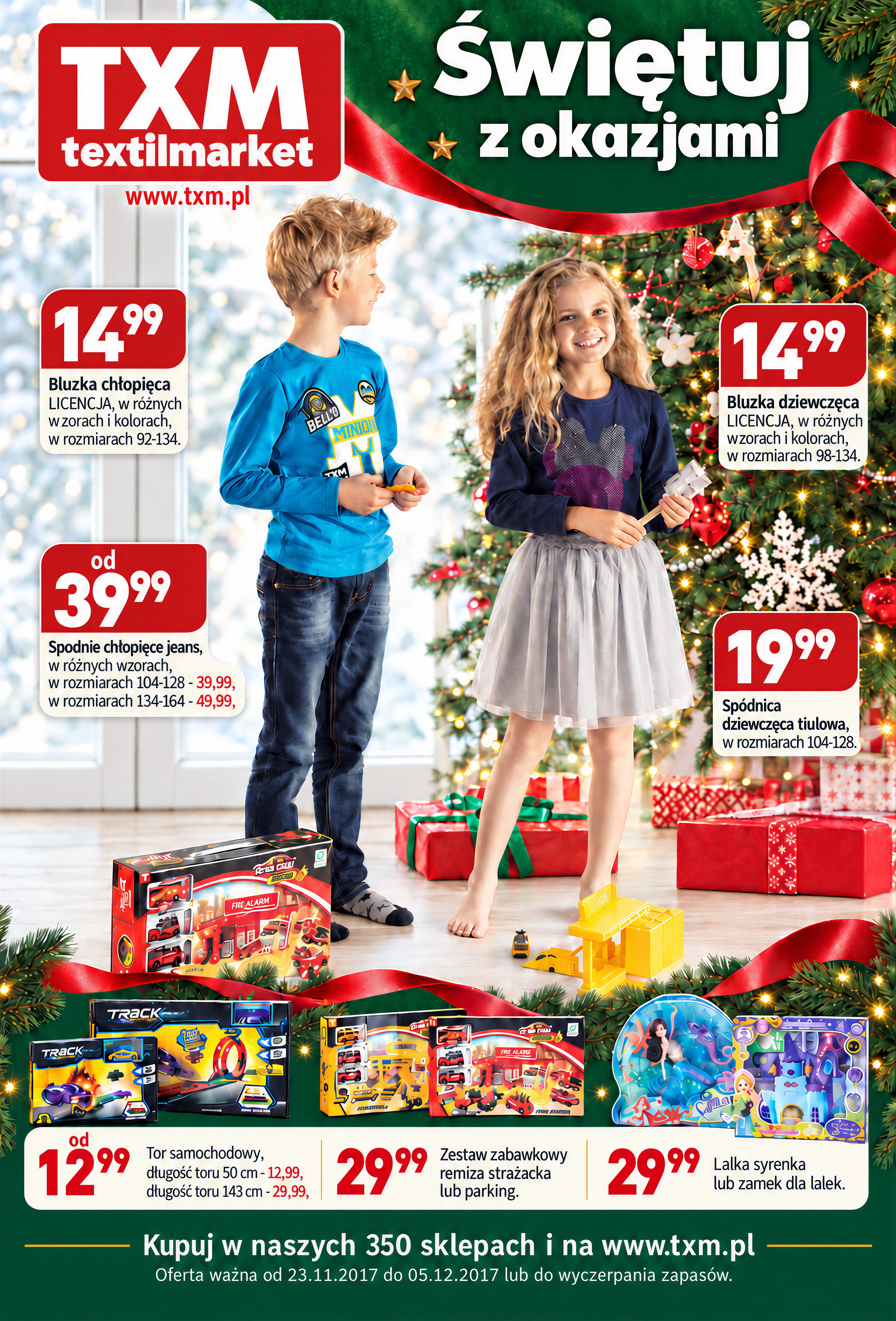
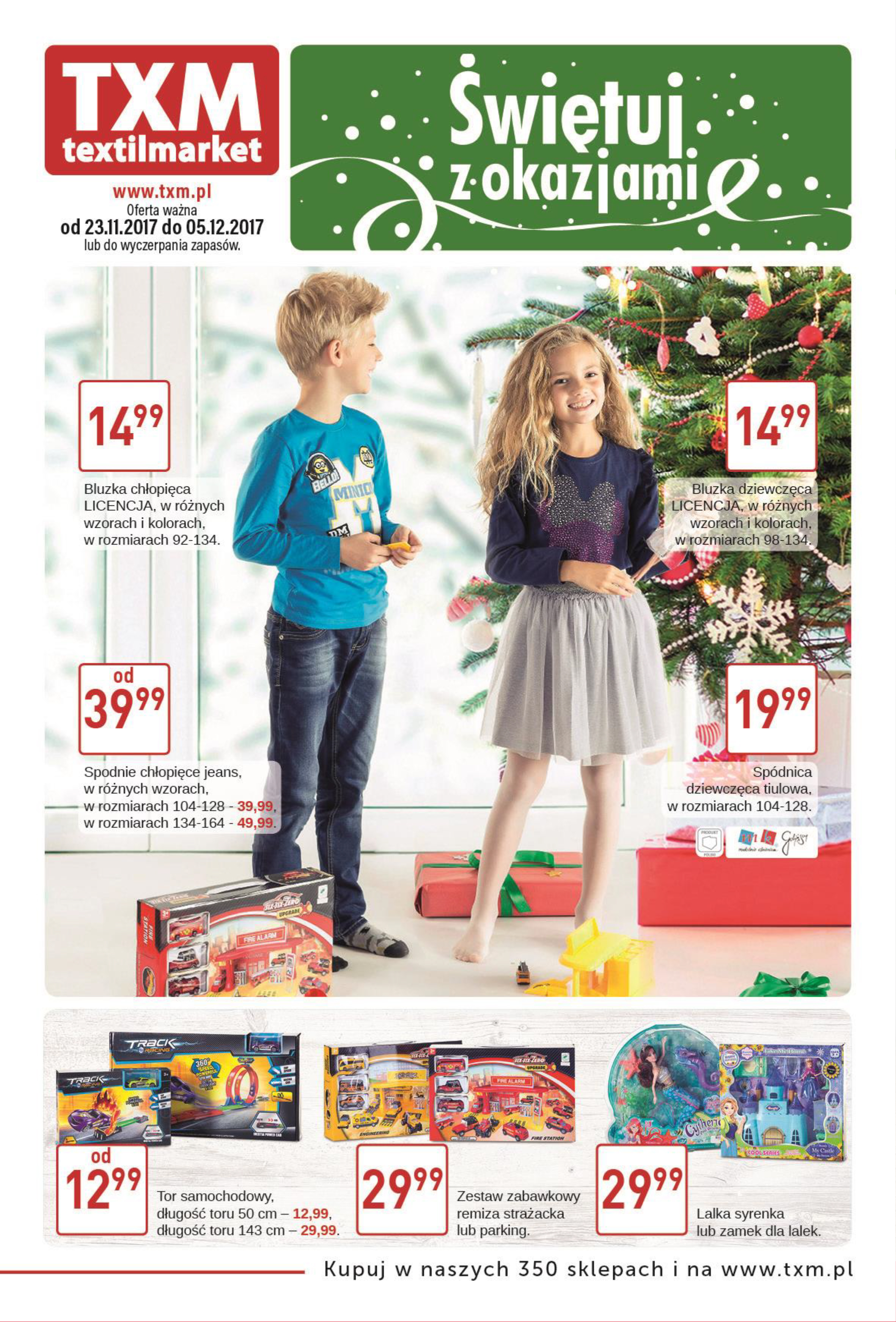
Drag left or right to compare. You can also use the arrow keys.
LET’S TALK
A fresh identity, a standout campaign or clearer communication? Tell me what you have in mind. I can help with graphic design, copywriting and marketing, from a single project to ongoing support.
You don’t need a finished brief. A few words about your brand and your next challenge are a good place to start.